This is part 2 of my series on data literacy
In the first part of this post, I’ll be outlining my recommended steps for increasing your users’ data literacy maturity, and my theory for why they work. We’ll then dive into a data exploration workflow. We’ll be using this workflow with a “real world” example in the next post.
The methodology

These steps are iterative. The key is to start small and continue building and layering more complexity as you go.
The first step is to get a clear picture of the current level of data literacy in your organization. Along with understanding the current state, it is key to accept the limits to user adoption (aka human motivations and limited capacity for change). This first step builds on the concepts of human psychology I mentioned in the last post. But to truly take a user-centered approach to data literacy it’s important to understand two key things about your users: what is their current skill level, and what do they want[1]. Understanding these two things should be incorporated into the requirements gathering stage of any new data project.
Think of this first step like a foundation that builds an empathetic and human-driven approach to all the other steps. It will guide you on your next step – selecting use cases. Start out by picking data product opportunities with the highest possible benefit for the lowest possible amount of perceived effort. At least for your first few, you’ll also want to pick ones with pretty low perceived effort.
Once you have such a data product identified, it will be crucial to give your users and organization good reason(s) to put in that effort. Pay close attention to the perceived effort, and whether some groups of users will need to put in more effort (either perceived or actual).
Remember, users’ perception of benefit will go up if you can show them the connection to significant impact on important aspects of business performance (these are the things that are important to them!). Identify the impacts to tangible real-world things, like increasing sales or identifying low-performing products. Then integrate explanations of these impacts in dashboard demos, user training, and even annotations in the data products themselves.
An example: moving beyond averages
In this series, I’ll be focusing on a very specific use case: the challenge of moving beyond averages.
Some of the most common KPIs that many businesses use to monitor their performance are averages. Think average daily sales, or average product profitability. These top-level numbers are of course important for monitoring the overall financial performance of a company. But these types of KPIs can also be an area of great opportunity, because averages have the potential to oversimplify.
Understanding when and why averages don’t work that well is a crucial data literacy skill.
But before we get to that, let’s start with the basics.
What exactly is an average? Whether you’re using mean average, median, or even mode – the average is a way to describe the center of your data. It’s probably the first tool of descriptive statistics you were taught. Which is a fancy way of saying that it’s a method to summarize your data.
Ok so what’s so bad about averages? As much as this series may lead you to think that I am a rabid anti-average person, I promise you that’s not the case! I’d argue that averages are an extremely powerful tool for getting that super high-level summary of your chosen measure. I believe it should always be your first step.
But sometimes the average won’t be a good enough description of what’s really going on. There are no hard and fast rules, but if your data has either of these two issues, then averages are highly likely to be misleading.
- If you have a lot of variation in your data – a lot of very low or very high values or both
- If you have just a few extreme values
These will usually skew your average, especially the mean average. That means it won’t be a good representation of the center of your data.
For example, let’s say you’re looking at average profit, and you have one product with a much higher profit. It’s an extreme outlier compared to the profit of all other products. This could make the average profit higher than the majority of products sold. If the goal of the average profit KPI is to understand the typical profit, the average profit in this case would be inaccurate.
This is where you come in!
As data product experts, it’s our job to provide that expertise. So it’s up to us to make the case for when we think the average isn’t a good enough measure, and to convince our audience that we should develop a data product that provides a more complete picture. This could be a more complex measure, or more complex data visualizations, or both.
Analyzing fitness of averages: a data exploration workflow
You only need 3 ingredients: Mean (aka “average”), median, and range.
So let’s keep going with the same example. We want to test the fitness of average for profit[2].
The first step is to get the basic descriptive statistics on profit. In Tableau, this can be as simple as dragging profit into the view, along with the unit of analysis (in this case, we are looking at the order item level of detail). The only other thing you need to do is enable worksheet summary (from the worksheet menu). Now we get a nice simple list with everything we need:

Now we can compare the median and average profit. But the key question to always keep in mind is: compared to what? That’s where the range comes in. Think of range as your scale. Our goal is to figure out if the difference between the median and mean average is big. We can judge whether that difference is big in comparison to the difference between your lowest and highest value.
Unfortunately, it’s not always quite that simple. Sometimes your minimum and maximum value are extreme outliers. When that happens, we need to look at the range of values for the most common values. We can use the 1st quartile and 3rd quartile for that. The items between the 1st and 3rd quartile (otherwise known as interquartile range) make up the middle 50% of all values[3].
Quartiles are based on the median average. You can think of them kind of like finer grained attributes of the median. The 3rd quartile is calculated as the median value between the overall median average and the maximum value. In our example, the 3rd quartile of profit is $29.35. That means that 75% of all items have a lower profit than $29.35.
How does that help us? Well, it looks like the average profit of $28.61 is almost as high as the 3rd quartile value. In other words, the average profit is higher than close to 75% of all other values! It seems highly unlikely that this average describes the typical profit.
So we’ve figured out that the basic average probably doesn’t tell the whole story. Now we get to dig deeper and analyze the distribution of values round those averages
Show me…. your shape!
To understand the shape of the data distribution, there are two charts that rule the world.
![]()
But hold on. You might remember from my previous post, that I put these charts on the top right quadrant. That means they are both high effort and high benefit. So let’s look a little closer at why that is.
The boxplot wins at getting a super quick view of your data distribution. How low is your lowest profit compared to your highest? How do those lows and highs compare to the middle values – the median and the interquartile range?
It makes it easy to do three major analysis tasks visually: understand the size of your range, see how many outliers there are and how extreme they are, and compare the distribution of different categories.
The magic of the box plot does have its limits, though. If you have a lot of data points, the areas where there is more data will just have a bunch of dots stacked right on top of each other. You could compensate for that by playing around with transparency to get a sense of where your data is most dense. But it can be difficult to identify the exact range of values that have the most data, or exactly how many more dots there are in that area.
That’s where the histogram excels. It helps you see what the most frequent or common values are. It also gives the exact amount of values at each value range. This gives you a more precise understanding of how much more frequent those values are.
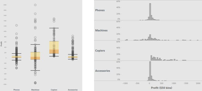
These two charts can help you understand the relationship of the average to the rest of the data, but in different and complementary ways. The box plot lets you see the location of the average in relation to all other values. The histogram lets you see how close the most common values are to the average.
But the boxplot and histogram each bring their own unique challenges that make them not the easiest to understand, at least not without some training
Boxplots: boxes, whiskers & other mathy terms. For the boxplot, it just takes some training to understand what the different parts of the box and whiskers represent. There are also some mathy concepts that many people may not remember from school – like median and quartiles. These are the very things that make boxplots so powerful, but they do require some up-front effort invested in learning both how to read the boxplot’s visual vocabulary, and in statistical concepts.
Histograms: This is not the bar chart you were looking for! The histogram looks just like a bar chart, so you’d think it would be pretty easy, right? But that’s actually where the challenge comes from. Imagine you’ve spent most of your life getting used to reading a bar chart, where the height of the bar represents how much. In our example, it would represent the total profit of each item ordered. Now you have to flip that. In the histogram, each bar now represents an interval of how much. The height of the bar now represents how many (how many items had between $1 and $50 in profit).
Both the histogram and boxplot are high effort primarily because of the initial learning required for users who have never used these charts before.
But as the data product expert, always remember this: the charts you use in your analysis can and in many cases will be different than those you will use for the data products that you create for communicating and presenting your data. That’s especially true for the charts you use towards the beginning of the analysis process.
So just because your organization isn’t quite ready for the histogram and box plot quite yet, that doesn’t mean you should miss out on these powerful tools.
To recap. The first steps in my recommended methodology for increasing data literacy and user adoption: Know and accept the limits to user adoption, for your users and your organization. Then, for every new data project that comes across your desk, you’re going to do some exploratory analysis. Using ugly not necessarily pretty or easy to read charts. The goal of this analysis is to figure out if the averages are good enough. You’re going to then use this data exploration workflow to identify a use case where you can demonstrate the added value of going beyond averages.
In the next part of this series, we’ll go through this data exploration workflow using our example KPIs of average profit and average sales. You’ll also learn how you can use this exploratory analysis to identify KPIs and charts that add more complexity, but at the right pace for your users.
[1] Dirksen, Julie. Design for How People Learn. 2015. pp. 27-56.
[2] In this example, we’ll be using Tableau’s Superstore dataset. For our purposes, profit amount is defined the total profit amount per order item. This is the lowest level of detail/granularity of the dataset.
[3] This is a super high level cliff notes version of these concepts. For a deeper dive, I highly recommend Alberto Cairo’s The Truthful Art, especially his section on averages in chapters 6-7.

Excellent article! When can I expect to continue?
Thanks so much!
Great timing on your comment – I will actually be posting the next part tomorrow morning.